GaugeChart
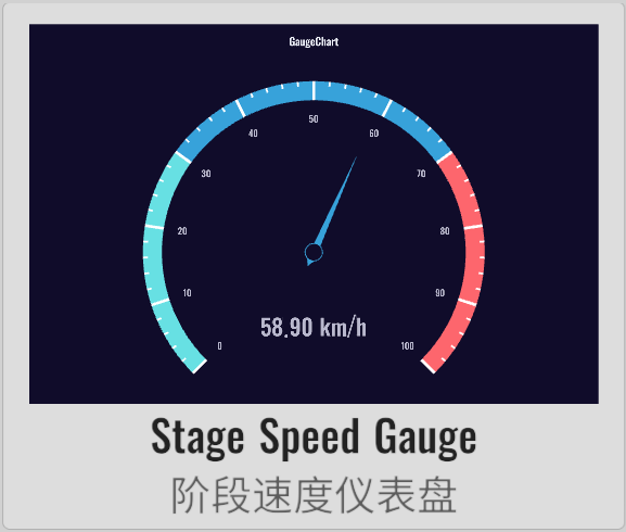
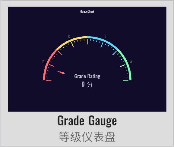
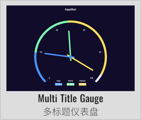
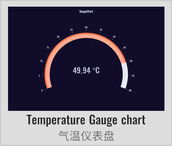
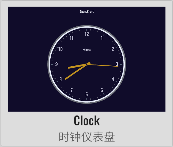
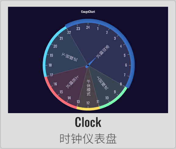
XCharts paid extension chart - Dashboard.
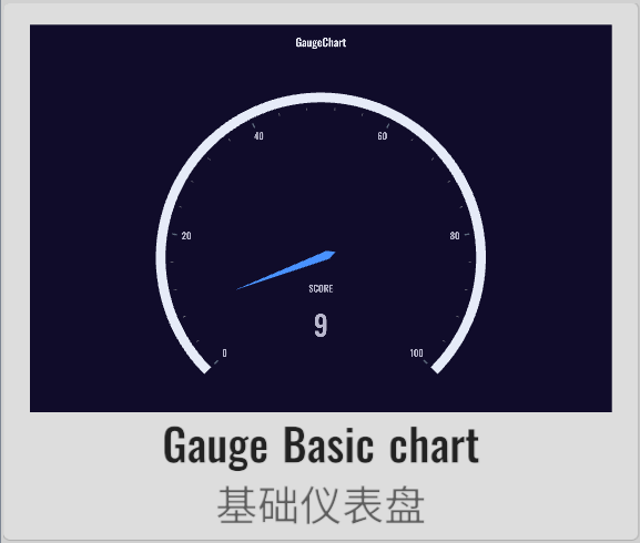 | 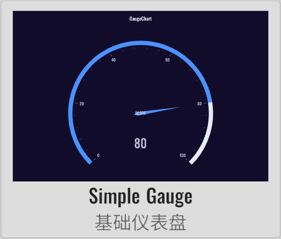 | 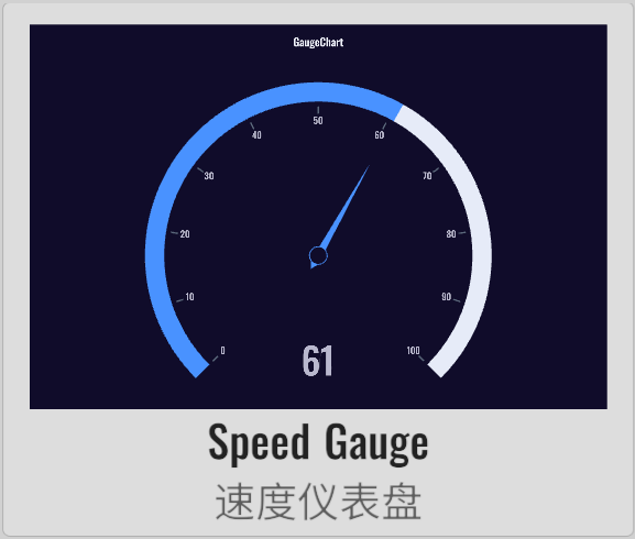 | 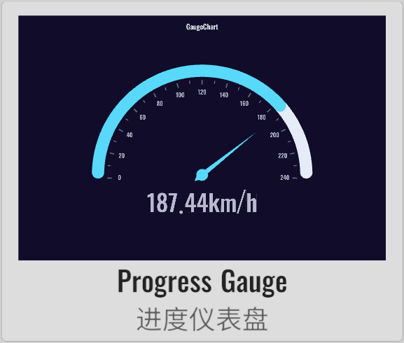 |
 |  |  |  |
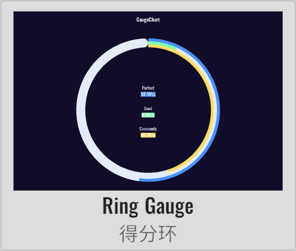 | 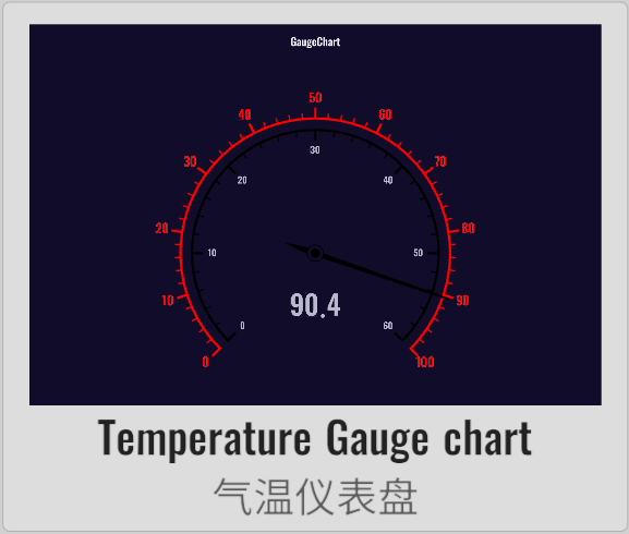 | 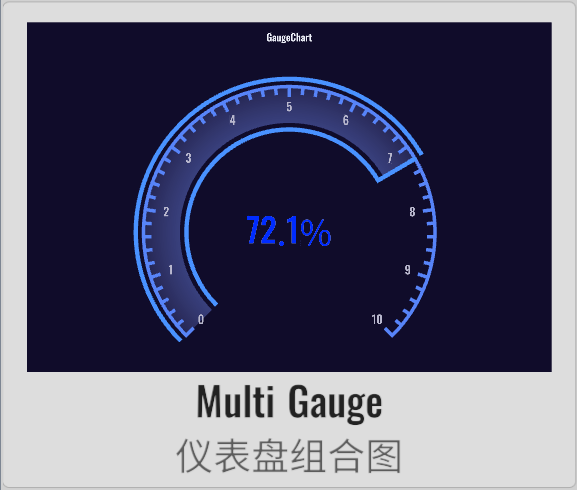 | 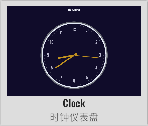 |
 |  |
License
Extension charts require a paid purchase to obtain a usage license.
Example
Demo repository: XCharts-GaugeChart-Demo
Tutorial
How to import extension charts into a demo project or your own project
Documentation
Changelog
v3.12.0
- (2024.09.30) Released version
v3.12.0 - (2024.09.30) Updated documentation
v3.11.0
- (2024.06.16) Released version
v3.11.0
v3.10.0
- (2024.01.21) Added more shortcuts and APIs for creating default
Gaugecharts
v3.9.0
- (2023.12.01) Released version
v3.9.0 - (2023.12.01) Updated documentation
v3.8.0
- (2023.07.31) Synchronized with
XCharts v3.8.0
v3.6.1
- (2023.06.08) Released version
v3.6.1 - (2023.06.08) Updated documentation
v3.6.0
- (2023.04.01) Released version
v3.6.0 - (2023.03.17) Added
rangeDataModeforGaugeto set whether to use range data mode - (2023.03.17) Added
loopforGaugeto set whether data loops, used for clock Gantt charts - (2023.03.17) Added
valueforGaugePointerto set the pointer position - (2023.03.17) Added support for
Clockclock gauge charts - (2023.03.13) Added
nowTimeforGaugePointerto set the pointer to the current time - (2023.03.13) Added
valueforGaugePointerto set the current pointer position - (2023.03.13) Added support for
Clocktype Gantt charts - (2023.02.14) Synchronized with
XCharts v3.6.0
v3.5.0
- (2022.12.01) Released version
v3.5.0 - (2022.11.27) Adjusted
Documentationdocument structure
v3.4.0
- (2022.10.05) Added support for
stageGradientinGaugeAxisLineto set stage gradient color transitions
v3.3.0
- (2022.09.28) Released version
v3.3.0 - (2022.08.26) Fixed the issue where
Pointerdoes not display in normal mode - (2022.08.25) Added support for
labelcolor to change with value
v3.2.0
- (2022.08.22) Released version
v3.2.0 - (2022.08.19) Synchronized with
XCharts v3.2.0 - (2022.08.15) Supported gradients
API
Gauge
class in XCharts.Runtime.Gauges / Inherits from: Serie
serie of gauge chart.
Gauge.defaultColorBy
public override SerieColorBy defaultColorBy
Gauge.AddDefaultSerie
public static void AddDefaultSerie(BaseChart chart, string serieName)
Gauge.ClearComponentDirty
public override void ClearComponentDirty()
Gauge.ClearVerticesDirty
public override void ClearVerticesDirty()
Gauge.GetPointerColor
public Color32 GetPointerColor(ThemeStyle theme, int colorIndex, float angle, Color32 dataColor)
GaugeAnchor
class in XCharts.Runtime.Gauges / Inherits from: ChildComponent
GaugeAnchor.GetPosition
public Vector3 GetPosition(Vector3 center, float radius)
GaugeAxis
class in XCharts.Runtime.Gauges / Inherits from: ChildComponent
Settings related to gauge axis line.
GaugeAxis.axisLabel
public AxisLabel axisLabel
axis label style.
GaugeAxis.axisLabelText
public List<string> axisLabelText
Coordinate axis scale label custom content. When the content is empty, axisLabel automatically displays the content according to the scale; otherwise, the content is taken from the list definition.
GaugeAxis.axisLine
public GaugeAxisLine axisLine
axis line style.
GaugeAxis.axisTick
public AxisTick axisTick
axis tick style.
GaugeAxis.distance
public float distance
GaugeAxis.overlap
public bool overlap
GaugeAxis.show
public bool show
GaugeAxis.splitLine
public AxisSplitLine splitLine
slit line style.
GaugeAxis.type
public GaugeAxisType type
GaugeAxis.AddLabelObject
public void AddLabelObject(ChartLabel label)
GaugeAxis.ClearLabelObject
public void ClearLabelObject()
GaugeAxis.GaugeAxis
public GaugeAxis()
GaugeAxis.GetLabelObject
public ChartLabel GetLabelObject(int index)
GaugeAxis.GetStageColor
public Color32 GetStageColor(float rate)
GaugeAxis.GetStageColorByAngle
public Color32 GetStageColorByAngle(float angle)
GaugeAxis.SetLabelObjectActive
public void SetLabelObjectActive(bool flag)
GaugeAxis.SetLabelObjectPosition
public void SetLabelObjectPosition(int index, Vector3 pos)
GaugeAxis.SetLabelObjectText
public void SetLabelObjectText(int index, string text)
GaugeAxisLine
class in XCharts.Runtime.Gauges / Inherits from: BaseLine
GaugeAxisLine.backgroundColor
public Color32 backgroundColor
The background color of gauge axis.
GaugeAxisLine.stageColor
public List<StageColor> stageColor
The colors of stage.
GaugeAxisLine.stageGradient
public bool stageGradient
Whether to use gradients for transitions.
GaugeAxisLine.GaugeAxisLine
public GaugeAxisLine(bool show) : base(show)
GaugeAxisType
class in XCharts.Runtime.Gauges
仪表盘类型
Options:
None: 仪表盘类型Section: 分段Progress: 进度
GaugeChart
class in XCharts.Runtime.Gauges / Inherits from: BaseChart
Gauge chart.
GaugeChart.DefaultBarometerGaugeChart
public void DefaultBarometerGaugeChart()
generate barometer gauge chart.
GaugeChart.DefaultClockGaugeChart
public void DefaultClockGaugeChart()
generate clock gauge chart.
GaugeChart.DefaultMultipleGaugeChart
public void DefaultMultipleGaugeChart()
generate multiple gauge chart.
GaugeChart.DefaultProgressGaugeChart
public void DefaultProgressGaugeChart()
generate progress gauge chart.
GaugeChart.DefaultRangeClockGaugeChart
public void DefaultRangeClockGaugeChart()
GaugeChart.DefaultSectionGaugeChart
public void DefaultSectionGaugeChart()
generate section gauge chart.
GaugeChart.UpdateClockTime
public void UpdateClockTime(double hour, double minute, double second)
update clock time.
GaugeChart.UpdatePointerValue
public void UpdatePointerValue(double value)
update pointer value.
GaugePointer
class in XCharts.Runtime.Gauges / Inherits from: ChildComponent
Settings related to gauge pointer.
Configuration
Gauge
class in XCharts.Runtime.Gauges / Inherits from: Serie
serie of gauge chart.
Gauge.gaugeAnchor
仪表盘指针固定点。
Gauge.gaugeAxis
仪表盘轴线。
Gauge.gaugePointer
仪表盘指针。
Gauge.loop
bool false v3.6.0
the value is loop.
Gauge.rangeDataMode
bool false v3.6.0
Whether the value is range data. When this mode is enabled, each value in data is an array, the first value of the array is the starting value, and the second value is the ending value. The pointer has only one, and the data is drawn as a ring.
GaugeAnchor
class in XCharts.Runtime.Gauges / Inherits from: ChildComponent
GaugeAnchor.gap
float 0
the gap of symbol and line segment.
GaugeAnchor.image
Sprite
自定义的标记图形。
GaugeAnchor.imageType
Image.Type
GaugeAnchor.itemStyle
ItemStyle
The style of data item.
GaugeAnchor.offsetCenter
Vector2 Vector2(0, 0)
The offset position relative to the center.
GaugeAnchor.show
bool true
Whether to display the anchor.
GaugeAnchor.showAbove
bool true
固定点是否显示在指针上面。
GaugeAnchor.size
float 6
the size of symbol.
GaugeAnchor.type
SymbolType
the type of symbol.
GaugeAxis
class in XCharts.Runtime.Gauges / Inherits from: ChildComponent
Settings related to gauge axis line.
GaugeAxis.axisLabel
AxisLabel
axis label style.
GaugeAxis.axisLabelText
List<string>
Coordinate axis scale label custom content. When the content is empty, axisLabel automatically displays the content according to the scale; otherwise, the content is taken from the list definition.
GaugeAxis.axisLine
axis line style.
GaugeAxis.axisTick
AxisTick
axis tick style.
GaugeAxis.distance
float
GaugeAxis.overlap
bool true
GaugeAxis.show
bool true
GaugeAxis.splitLine
AxisSplitLine
slit line style.
GaugeAxis.type
Options:
None: 仪表盘类型Section: 分段Progress: 进度
GaugeAxisLine
class in XCharts.Runtime.Gauges / Inherits from: BaseLine
GaugeAxisLine.backgroundColor
Color32 Color32(230, 235, 248, 255)
The background color of gauge axis.
GaugeAxisLine.stageColor
List<StageColor>
The colors of stage.
GaugeAxisLine.stageGradient
bool v3.4.0
Whether to use gradients for transitions.
GaugePointer
class in XCharts.Runtime.Gauges / Inherits from: ChildComponent
Settings related to gauge pointer.
GaugePointer.autoColor
bool true
GaugePointer.backExtraLength
float 0.05f
Pointer back extra length. It can be an absolute value, or it can be a percentage relative to the radius (0-1).
GaugePointer.backLength
float 0.05f
Pointer back length. It can be an absolute value, or it can be a percentage relative to the radius (0-1).
GaugePointer.bottomLeftLength
float 0.025f
Pointer length. It can be an absolute value, or it can be a percentage relative to the radius (0-1).
GaugePointer.bottomRightLength
float 0.025f
Pointer length. It can be an absolute value, or it can be a percentage relative to the radius (0-1).
GaugePointer.color
Color32
GaugePointer.cornerRadius
float[]
The radius of rounded corner. Its unit is px. Use array to respectively specify the 4 corner radiuses((clockwise upper left, upper right, bottom right and bottom left)).
GaugePointer.distance
float
GaugePointer.length
float 0.6f
Pointer length. It can be an absolute value, or it can be a percentage relative to the radius (0-1).
GaugePointer.roundCap
bool
GaugePointer.show
bool true
Whether to display a pointer.
GaugePointer.toColor
Color32
GaugePointer.topLeftLength
float 0f
Pointer length. It can be an absolute value, or it can be a percentage relative to the radius (0-1).
GaugePointer.topRightLength
float 0f
Pointer length. It can be an absolute value, or it can be a percentage relative to the radius (0-1).
GaugePointer.value
double v3.6.0
The value of pointer. When it is a clock gauge, the value can be specified to control the position of the pointer.